6.2 Matt Rawski

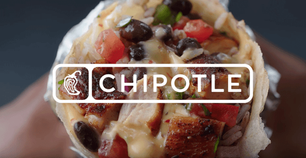
1. The only P of the marketing mix that this Chipotle advertisement focuses on is their Product. The advertisement is straight up a picture of one of their burritos, which is their main product. They also presented their product in a way that showcases each of the ingredients in their burrito, to engage our senses.

2. The target market is this advertisement is anyone who is hungry. I know this is the target market because they are presenting their product, which is a food, in a way that is appealing to us to make us hungry and appeal to our desire to eat good food. They did a good job of reaching us because they presented their product in the advertisement

3.  This is an effective advertisement. They presented the burrito with vibrant colors and in a way that makes us hungry for a chipotle burrito. I am so hungry right now as I write this, and my mouth is watering, so this is definitely and effective advertisement for me. They also showcased the ingredients well, and presented the product with extremely high graphics so we can see every detail of the ingredients. This give us a sense of the high quality of their burrito. Also they presented the burrito “open” and facing towards us in someone’s hand, just like how you would see the burrito before you take a bite yourself. This was smart and intentional.

Matt Rawski 6.1

1. This advertisement implemented mostly the Price and Product Ps of the marketing mix. They focused on Price in their advertisement when they communicated at the bottom that a membership at planet fitness is $10 down and $10 per month. This communicates the price of their service. Also their saying “pay diddly for your squats” communicates that their price is low. They also focused on the product in their “pay diddly for your squats”, this communicates that you do squats at their gym

2.  Their target market is people who are wanting to get in shape, and who are price conscious. I know this because their advertisement is aimed to communicate their low prices, and because I know (from prior knowledge) that their gym is for people who are newer to working out.

3. I think that this is a very effective advertisement. Not only is the color scheme great in catching attention, and it shows the company logo, but it is also effective in communicating in a funny personable way that their service is lower price. They did it in a funny and creative way that catches attention and effectively communicates their service to their target market. The phrase “pay diddly for your squats” is humorous and witty.

Matt Rawski 5.2

1.  The main P of the marketing mix that this Reese’s advertisement focuses in on is the Product P. The main message of this advertisement is to showcase their main product- the reeses Peanut Butter Cups, and to communicate what is in their product. They tell you that their Reeses Peanut Butter Cups have the perfect combination of Chocolate and Peanut butter.

2. The target market of this advertisement is anyone who eats candy or sweets and anyone who is hungry, which is a large target market. I know that this is the target market because of previous knowledge, and because it is food. I think that the company made good decisions to reach this target market, however where this advertisement is placed is important for evaluating whether good decisions were made for reaching this target market. If this advertisement was a facebook ad that came across someones feed at 5 AM, it would be ineffective. However if it is placed right next to a grocery store, or gas station, it would be highly effective.

3. Aside from location, I believe that this advertisement is effective and is a good advertisement. It uses a bright orange color to draw the eyes of the audience, and it does a good job of showcasing its product with a bite taken out of it. The bite is an invitation for you as the audience to also buy one and take a bite. Also the “it’s a perfect combo of chocolate and peanut butter” appeals to your taste buds and makes you want to eat one. My mouth is watering right now as I write this analysis, because this ad is making me want to eat a Reeses PB Cup, so at least this advertisement is working on me.

Matt Rawski 5.1


1. This is an advertisement, and the main Ps of the marketing mix that this advertisement focuses on is the Promotion and sort of Product. Pringles focused on the Promotion of its brand by having its name written twice on the advertisement. It also focused on the Product P, because it shows the pringles tube and some individual pringles chips in the ad.
2.  The target market is people who need snacks and enjoy Christmas. I know this is the target market because the advertisement is Christmas themed, and because pringles is a snack food. I think the company made good decisions to reach the target market because the advertisement does a good job of making pringles “Christmasy”.

3. This advertisement is effective, and I believe it is more effective in promoting the brand of Pringles than it is in promoting the Product of the pringles snack. The main point of the ad in my opinion is for pringles to associate themselves with Christmas, and to borrow from the positive brand equity that Christmas has, so that people translate that positive equity to pringles. They want people to associate the two together, and therefore view pringles in a more positive light as a brand. They do this well by using the red and white Christmas colors very effectively, and by using their product to make a Christmas tree. They also make a play on the song “jingle bells” and use their name instead in “pringle bells.” Overall that is why I believe that this advertisement is highly effective.

Matt Rawski 4.2

  1. The only P that this company implemented in this advertisement is the Product P. The whole message of the advertisement is that their lollipops are sugar-free. They say it, along with their product name- Chupa Chips, and have a photo that communicates that they are sugar free.
  2. The target market for these Chupa Chips is probably almost anybody, but specifically those who are health conscious.  The reason for this is because almost everybody likes lollipops, but they are pretty unhealthy. So someone who is more health conscious would be more inclined to eat a chupa chip because they are sugar free.
  3. This advertisement works well in communicating how their chupa chips are sugar free. They show an image of one of their chupa chips, so the audience gets to see their product. What makes this image pop is the fact that the ants are walking around the lollipop. Everybody knows that ants gravitate towards sugar, and take it away anytime they can. So the fact that they are avoiding their lollipop (that most ants would want to eat) significantly demonstrates how their product is sugar free. Because of this I believe it is an effective advertisement

Matt Rawski 4.1

  1. In this advertisement from weight watchers, they focus mostly on the product P of the marketing mix, and you could argue that they also focus on the place. In this advertisement, the main message is that when you come into weight watchers you are fat, but when you leave weight watchers you are skinny. They do this by labeling the huge door for a fat person as the entrance door, and they label the skinny door for a skinny person the exit door for the weight watchers door. They are trying to communicate that their product/service will cause you to lose a lot of weight. I will speak more to how this advertisement talks about place in section 3 of this blog.
  2. The target market of this advertisement is people who are fat. I know this because fat people are the kind of people who would need that bigger door to enter into weight watchers. I think that they did a good job at reaching their target market because the door is extremely, over the top huge. So most people who are just moderately obese wouldn’t feel that much shame about coming in the program with such a huge door, because they would feel that they are not over the top obese.
  3. I think that this is a very effective advertisement that communicates that their service/product will cause you to lose a lot of weight. The reason that it works is because of the dramatic difference between the size of the doors. The light green color of the wall and hardwood floors makes weight watchers feel homey and inviting. Also the entrance door is cracked open, symbolizing that people are welcome to come in. Because of those two elements I think that this advertisement also communicates about the Place that weight watchers has (marketing mix).

Matt Rawski 3.2

1)This is advertisement for the west short home company, who is a window installation company. This advertisement uses three of the four Ps. The main P it uses is product, and it is communicating how their windows are energy efficient…. they are emphasizing the quality of their product. This is using promotion, because it is a billboard advertisement to promote their product. It also uses place, because it says how to reach them/how to use their service by leading them to their website on the bottom. This advertisement does not speak to the price aspect of their business.

2)Through this advertisement, you can easily guess that their target market is home owners, who are men and are the heads of the household, and you can probably guess that this billboard is likely located in the south. I can conclude this because they are saying they have a wife, which implies they are married. Also because if their wife is warm, it is likely in a southern state with very hot weather.

3)This advertisement is highly effective in reaching its target market. This advertisement is boarder line genius. It very effectively grabs the attention of the drivers by the dramatic contrast in the color scheme (bright and dark colors) and with a bold statement to hook the attention of the viewers in “your wife is hot”. Almost all men would find this humorous and witty, and be favorably disposed to check out their company if they needed new windows.

Your-Wife-Is-Hot-Get-Her-More-Energy-Efficient-Windows-Funny-Advertisement-Signboar.jpeg

Matt Rawski 3.1

Image result for hoover our vacuums suck

  1. This is a billboard advertisement for Hoover company. They primarily sell vacuums and cleaning tools. In this advertisement they have a picture of their Hoover vacuum, their company logo, and the statement “our products suck.” In this advertisement they are focusing on two of the Ps of the marketing mix, Promotion and product. They are using promotion because this is an avenue that they are promoting their product and brand, on a billboard. They are also promoting their product in this advertisement. I will describe why the statement “our products suck” is effective in promoting their product in section 3 of this blog post
  2. Their target market for their product is anyone who lives in a home. I don’t think that just from this advertisement you could tell who the target market is, but with prior knowledge I know who the target market is. Even though this advertisement does not specifically target explicitly its target market with this advertisement in terms of the content, it did with its location of the advertisement. This is a billboard where lots of homeowners drive by every day.
  3. I think that this is a good billboard. The statement “our products suck” by itself is a negative statement that you wouldn’t expect any company to use to promote their products. However give that their product is a vacuum, it is pretty witty and clever. As the market sees this advertisement, and they read that statement, they likely subconsciously are thinking “the Hoover company wouldn’t say that unless they were very confident that their product was exceptional,” and in this way this advertisement actually promotes the quality of their product. Because of the subconscious response to this advertisement, I believe that it is an effective advertisement. Another thing that this advertisement does well is highlights their logo. The advertisement is all a Black and White color scheme, except for the company logo is bright red. Because of this the logo stands out.

Matt Rawski 2.1

This image has an empty alt attribute; its file name is image.png

Describe in detail the image, and why you believe the company selected the brand elements (color, size, layout, character, etc.) that they did. Your analysis should include a brief description of the competitors and how your selected brand logo compares. In other words, why did they choose the brand elements that they did.

This the logo for the Ritz-Carlton hotel, which is one of the, if not the most luxury hospitality companies in the world. The logo is black and white, and is a crown, with a lion on top of it, and the ritz carlton name uses a royal and elegant font. I think that the ritz carlton company is trying to communicate that they are elegant and noble in what they do, and they are also trying to communicate that you are upper class and noble if you stay at their hotels. Most other hotels have a more simple logo that is mostly just their name in a specific font and color scheme. The Ritz Carlton logo has a design of the lion and the crown. I think that the Ritz Carlton did this because they wanted to stand out from the rest, and communicate that they are the best of the best.

2. Describe the target market (ie. what segments are being targeted)? How do you know this is the target market? Did the company make good decisions to reach the target market?

The target market for the ritz carlton is the upper class/ elites in society. They target them because they have the finances to be able to stay at their higher end hotel, to be able to pay a premium price for a premium experience. I know this is the target market because I know about the company previously, but their logo also communicates that they are a higher end business. I think that this is a great logo for the Ritz Carlton company, because it accurately reflects who they are and who they are trying to reach.

3. Does it work? Why or why not? Any general observations?

I think that this logo is a great logo. If a customer walks into the Ritz Carlton hotel, they are going to feel like they are royalty, which is the brand communicated on the logo. I think that ultimately the logo is perfect for the Ritz Carlton hotel because it accurately communicates who they are and who they serve.

Matt Rawski 2.2

1A. If it’s an advertisement: · Describe in detail how the business implemented the four P’s to add value and/or promote the product or service.

This was a super bowl advertisement from last year. This advertisement was mostly going after promoting their Product and informing their target market about the ingredients of their product and of the ingredients of their competition. They chose to put this add in the biggest platform for advertisement in the world. This add had no mention of the price of the place where they sell their product. The main emphasis as far as aspects of the marketing mix of this advertisement is on their product, and informing their audience about their product.

2. Describe the target market (ie. what segments are being targeted)? How do you know this is the target market? Did the company make good decisions to reach the target market?

The target market is American adults over 21 years old. I know this is the target market because they have the ability to purchase alcohol, and they are the people who are watching the super bowl (which is where they promoted their product). The company made great decisions in trying to reach the target market, because of where they placed this advertisement. The super bowl is the biggest platform for advertisement in the world, and so they would be able to reach the greatest audience through making this a tv commercial shown during the superbowl.

3. Does it work? Why or why not? Any general observations?                                                 

This is one of the best advertisements I have ever seen. Bud Light was TAKING SHOTS at miller light and coors light. In culture today, there is a growing movement to eat healthier foods, and culture is becoming more aware of the negative affects of corn syrup. Bud Light takes advantage of this cultural aspect to do serious damage of the view on their competitions product, and promoting their own product at the same time. They do it in a funny passive aggressive way that doesn’t make them look like bullys, but rather “big ballers.” This is an exceptional advertisement that is very effective.

Design a site like this with WordPress.com
Get started